


NITO's logo
NITO's logo represents our identity and must be used correctly to maintain a consistent visual profile. Here you will find NITO's official logo, which can be downloaded in various formats.
Logo for use on the appraisal report, website, car, etc.
Below you can download the "Member of" logo:
Guidelines for the use of the "Member of" logo
- Respect the free zone in the logo file
- White text is used on dark background
- Black text is applied to light backgrounds
- Png/svg is for use on screens
- Ai is for print
Logo for press and media use
Below you can download the primary logo:
Primary Logo Use Guidelines
To ensure correct use of NITO's logo and visual identity, follow these guidelines:
- The logo should always have the right proportions and colors.
- Do not alter or distort the logo.
- Make sure there is sufficient air around the logo.
- Use only approved color variations of the logo.
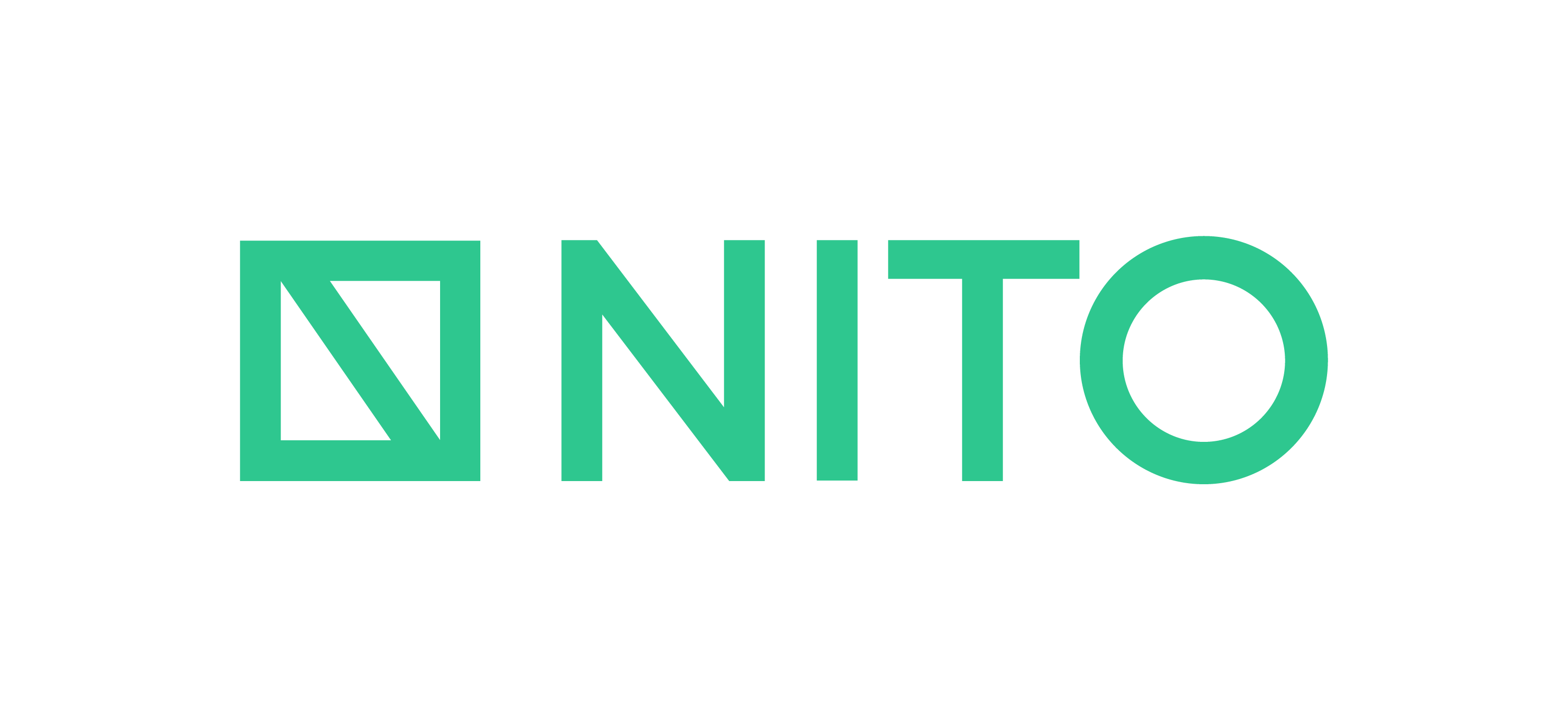
Examples of use
Here are some examples of correct and incorrect use of NITO's logo.
Correct use:
- Green deep logo is used primarily on white background, and green clear and white logo primarily on green deep background.
Improper use:
- The logo is stretched or compressed.
- Colors of the logo change.
To be able to read the profile manual, you must become a member or log in.
Do you have questions about logo or profiling?
Isabell Strandskogen
Seniorrådgiver